ShopDreamUp AI ArtDreamUp
Deviation Actions


Suggested Deviants


Suggested Collections


You Might Like…


Featured in Groups

Description
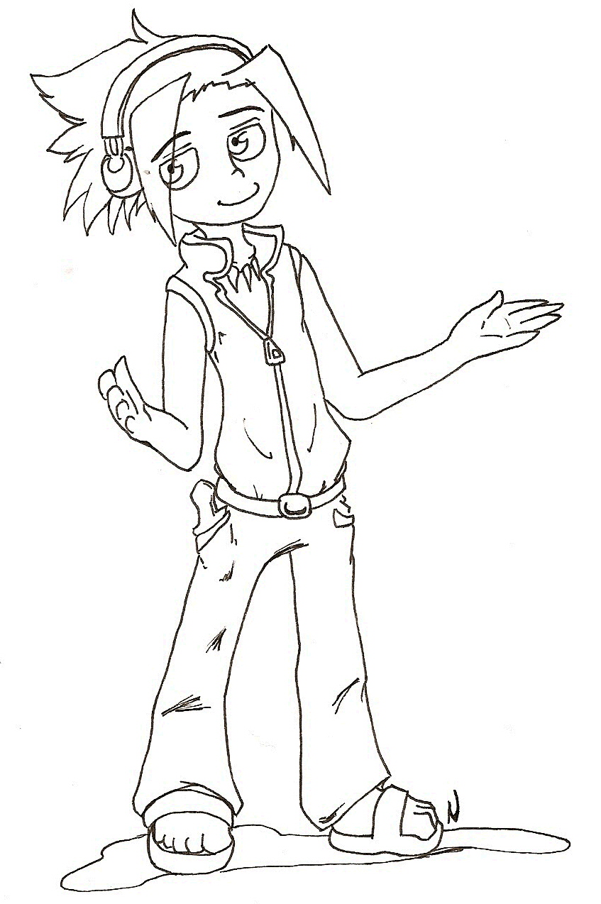
...well he didnt like his battle uniform when he first wore it and i wasnt really a big fan either >:C
omg guys, guess what!!!! I might be going to Animethon in Edmonton!! I havent gotten permission from my parents, but I havent gotten a no yet either
  but if i can go, i totally want to cosplay as Yoh!
OHANDBYTHEWAY
i submitted this to a group full of people who can draw humans better than I (Smile)") Could some of you please critique the heck out of this? xD at least the face, because it sucks :C ive improved at bodies over time, but human faces have always been a pain that i can't seem to improve upon. So critique this mercilessly! >: D (but be polite lol)
Could some of you please critique the heck out of this? xD at least the face, because it sucks :C ive improved at bodies over time, but human faces have always been a pain that i can't seem to improve upon. So critique this mercilessly! >: D (but be polite lol)
Yoh Asakura belongs to Hiroyuki Takei.
omg guys, guess what!!!! I might be going to Animethon in Edmonton!!
OHANDBYTHEWAY
i submitted this to a group full of people who can draw humans better than I
Yoh Asakura belongs to Hiroyuki Takei.
Image size
847x1274px 310.23 KB
Make
HP
Model
HP pstc3100
Date Taken
Jul 20, 2010, 11:35:44 PM
© 2010 - 2024 nikkihog
Comments10
Join the community to add your comment. Already a deviant? Log In
Hey, you asking for critique is so rare, I'll take the opportunity while it's there >8D So uhh since you ask for the face I'll start with that .w.
Here I think the main problem is the eyes :U Since they're rather large and that you completely outlined them, they look too googly XD There a good reason all animes leave the sides of the eyes without lines XD Unless you're going for an extremely cartoony look, eyes are best left with spaces in their lineart, make it look less goofy and less OuO-ish :U Also I think his right eye is a bit too far off to the right XD I know there's foreshortening with the other eye and all, but the space between his right eye and nose it too big so you might wanna get the eye closer XD Other than that his eyes look pretty good, the expression is very well done 8D and I know you're trying to get yourself a new style so I can say you're doing good so far X3 I like how you indicated his eyelid too")
Another thing is his smile XD I think he was supposed to hard a relaxed/"see?" expression, but he looks more like he's going ¬3¬ because of his mouth XD I'm no expert on mouths, but I think that the problem is the little curve on the left side o his lips :U since his face is slightly turned away from us, it looks like he's doing a kissy face XD I dunno how I can explain that but usually when there's a 3/4 view on a smile it usually looks something like a ~ or a side smile XD
Also his hair bug me a bit XD The left bang is too straight, it should either be flopping down or curving in a S shape with movement if he's moving XD Now it looks a bit weird since it's really far away from his face XD The hair behind his head is really high too, it almost looks like he has them tied up XD but he doesn't, and since his hair is supposed to me longish, his hair should rest a bit over his shoulders and on the nape of his neck instead of spiking backwards XD I think if you made the hair start at the point where the line of his face and neck meet it'd look good :U Liquid paper my dear >: D
As for the rest of the body, I think you still have a bit of problems with proportions XD His torso and his legs are almost the same lenght and, while it does give it a certain style I actually like alot, it makes his arms look really long XD Usually the elbows are supposed to be able to rest on the hipbone and the hands on thighs, but here the elbows would rest on his stomach and the hands on the knees o.o So yeah keep in mind that the legs are usually two times the lenght of the body when you're drawing ppl XD
Theres also the hands and feet that aren't too great D: His left hand especially, the lenght of the fingers are way too different and his pinky isn't aligned with the others, it looks like a second thumb actually XD Although I really like how you indicated the more fleshy part of the hands and that the thumb look really nice, his pinky freaks me out XD The one with perspective is nicely done though, but you'd really need to shade it for it to really look good X3 as for the feet, my main problem is that they're too short, I dunno any good thing to compare the lenght of feet, but they're definitely too short XD Feet are usually longer than hands, but here they're a it shorter, so try using that to lenghten them a bit :U
Anyway :U I really like how you did his clothes X3 You're getting pretty good with folds, especially the ones on his chest and where his vest puffs and is tucked in his pants X3 I really like the indication of his dagger in his pocket and the collar part of his vest too X3
There I critiqued the hell out of it >8D But still I'm not an expert on huminz so I dunno :U
Here I think the main problem is the eyes :U Since they're rather large and that you completely outlined them, they look too googly XD There a good reason all animes leave the sides of the eyes without lines XD Unless you're going for an extremely cartoony look, eyes are best left with spaces in their lineart, make it look less goofy and less OuO-ish :U Also I think his right eye is a bit too far off to the right XD I know there's foreshortening with the other eye and all, but the space between his right eye and nose it too big so you might wanna get the eye closer XD Other than that his eyes look pretty good, the expression is very well done 8D and I know you're trying to get yourself a new style so I can say you're doing good so far X3 I like how you indicated his eyelid too
Another thing is his smile XD I think he was supposed to hard a relaxed/"see?" expression, but he looks more like he's going ¬3¬ because of his mouth XD I'm no expert on mouths, but I think that the problem is the little curve on the left side o his lips :U since his face is slightly turned away from us, it looks like he's doing a kissy face XD I dunno how I can explain that but usually when there's a 3/4 view on a smile it usually looks something like a ~ or a side smile XD
Also his hair bug me a bit XD The left bang is too straight, it should either be flopping down or curving in a S shape with movement if he's moving XD Now it looks a bit weird since it's really far away from his face XD The hair behind his head is really high too, it almost looks like he has them tied up XD but he doesn't, and since his hair is supposed to me longish, his hair should rest a bit over his shoulders and on the nape of his neck instead of spiking backwards XD I think if you made the hair start at the point where the line of his face and neck meet it'd look good :U Liquid paper my dear >: D
As for the rest of the body, I think you still have a bit of problems with proportions XD His torso and his legs are almost the same lenght and, while it does give it a certain style I actually like alot, it makes his arms look really long XD Usually the elbows are supposed to be able to rest on the hipbone and the hands on thighs, but here the elbows would rest on his stomach and the hands on the knees o.o So yeah keep in mind that the legs are usually two times the lenght of the body when you're drawing ppl XD
Theres also the hands and feet that aren't too great D: His left hand especially, the lenght of the fingers are way too different and his pinky isn't aligned with the others, it looks like a second thumb actually XD Although I really like how you indicated the more fleshy part of the hands and that the thumb look really nice, his pinky freaks me out XD The one with perspective is nicely done though, but you'd really need to shade it for it to really look good X3 as for the feet, my main problem is that they're too short, I dunno any good thing to compare the lenght of feet, but they're definitely too short XD Feet are usually longer than hands, but here they're a it shorter, so try using that to lenghten them a bit :U
Anyway :U I really like how you did his clothes X3 You're getting pretty good with folds, especially the ones on his chest and where his vest puffs and is tucked in his pants X3 I really like the indication of his dagger in his pocket and the collar part of his vest too X3
There I critiqued the hell out of it >8D But still I'm not an expert on huminz so I dunno :U